Project
Kraftur
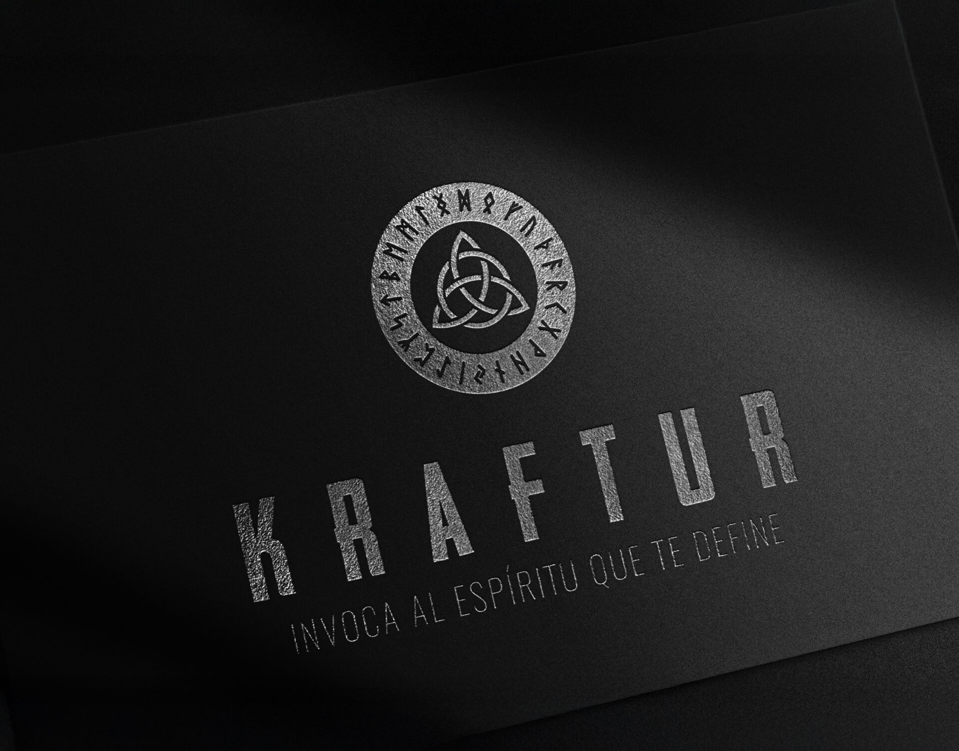
This is a visual identity project developed in response to a client brief: to create a brand that embodies the idea of invoking an inner god through a Nordic-inspired visual language.
Based on the brief, I developed the brand strategy, naming, and identity, grounded in the concepts of strength and individuality.
The Idea
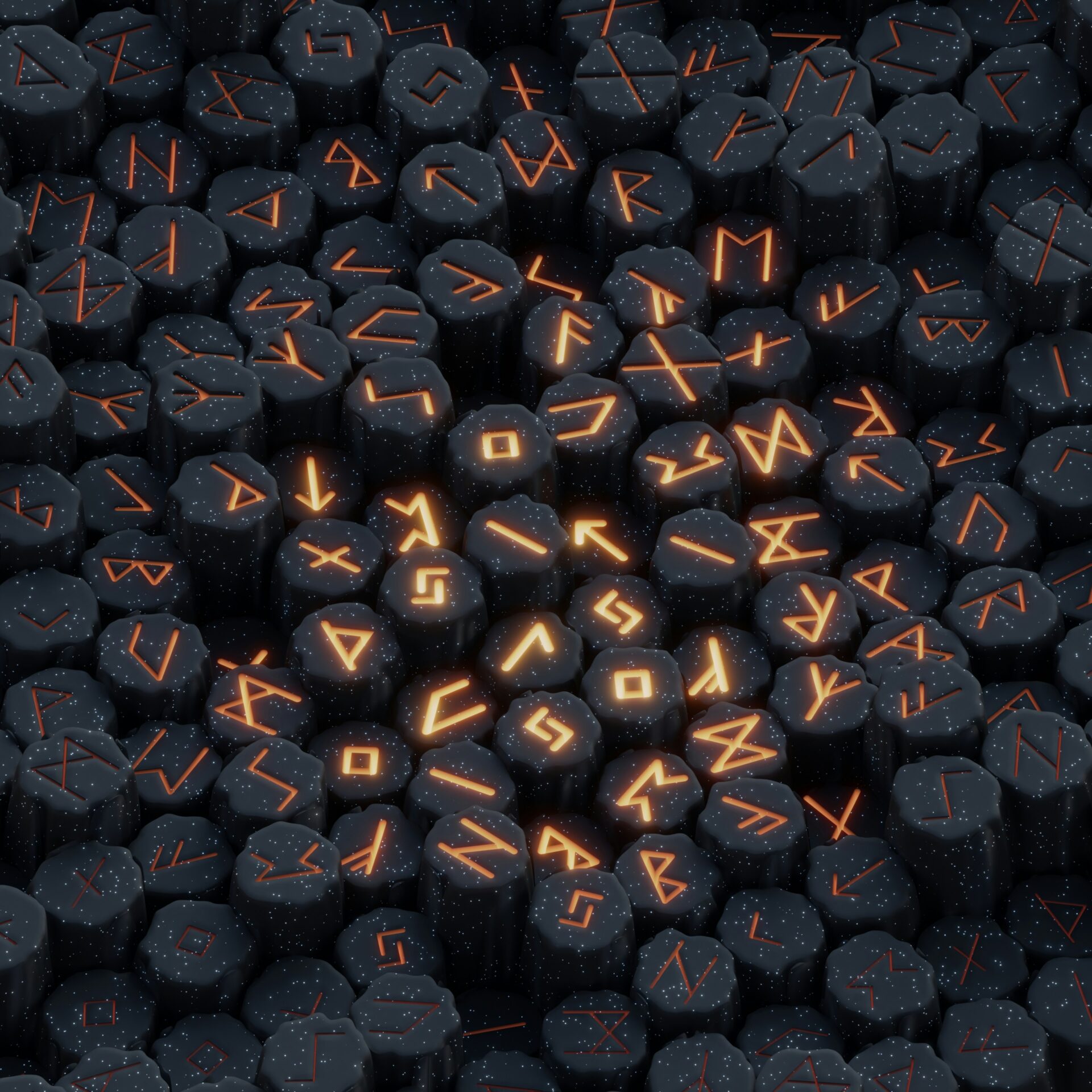
It was born from a strategic process that, starting with the brief and a market analysis — competitors, typography, communication, color palette, composition, and forms — combined with tools such as Simon Sinek’s Golden Circle and the definition of a brand manifesto, led me to the brand archetype and the construction of the logo’s personality. This foundation, together with the concepts of strength and individuality, gave rise to the name Kraftur and its visual identity.
.
Client
Fashion Accessories Brand
Work
Brand Strategy, Naming & Visual Identity
My Role
My Approach & Contributions
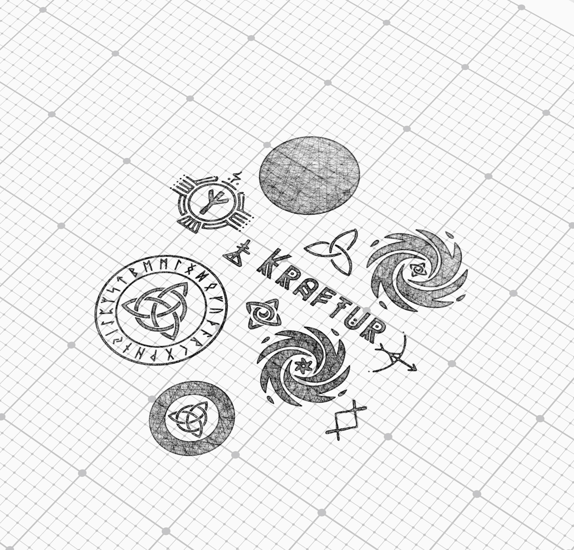
A partir de una investigación y exploración de la simbología nordica, la idea fue dar con un símbolo tipo talismán que diera la idea de invocación.
The Results
Get in touch!
To discuss your new project!
Feel free to contact me with any inquiries or questions!
